Project One
SARDINES App UX / UI Design
Description
Commuting in Toronto during rush hour is never a pleasant experience. Especially when there are simply not enough vehicles to cater for the masses. Through my research and conversations with passengers, I discovered that the majority of commuters find overcrowding and long delays to be the most prominent pain points about the dreaded rush hour experience. SARDINES the App is here to make life easier and provide a little happiness and humour along the way.
SARDINES the App supplies the user with real-time capacity data of approaching streetcars, maintaining accurate and reliable information listed in a level of “Happiness” to “Sardines”.
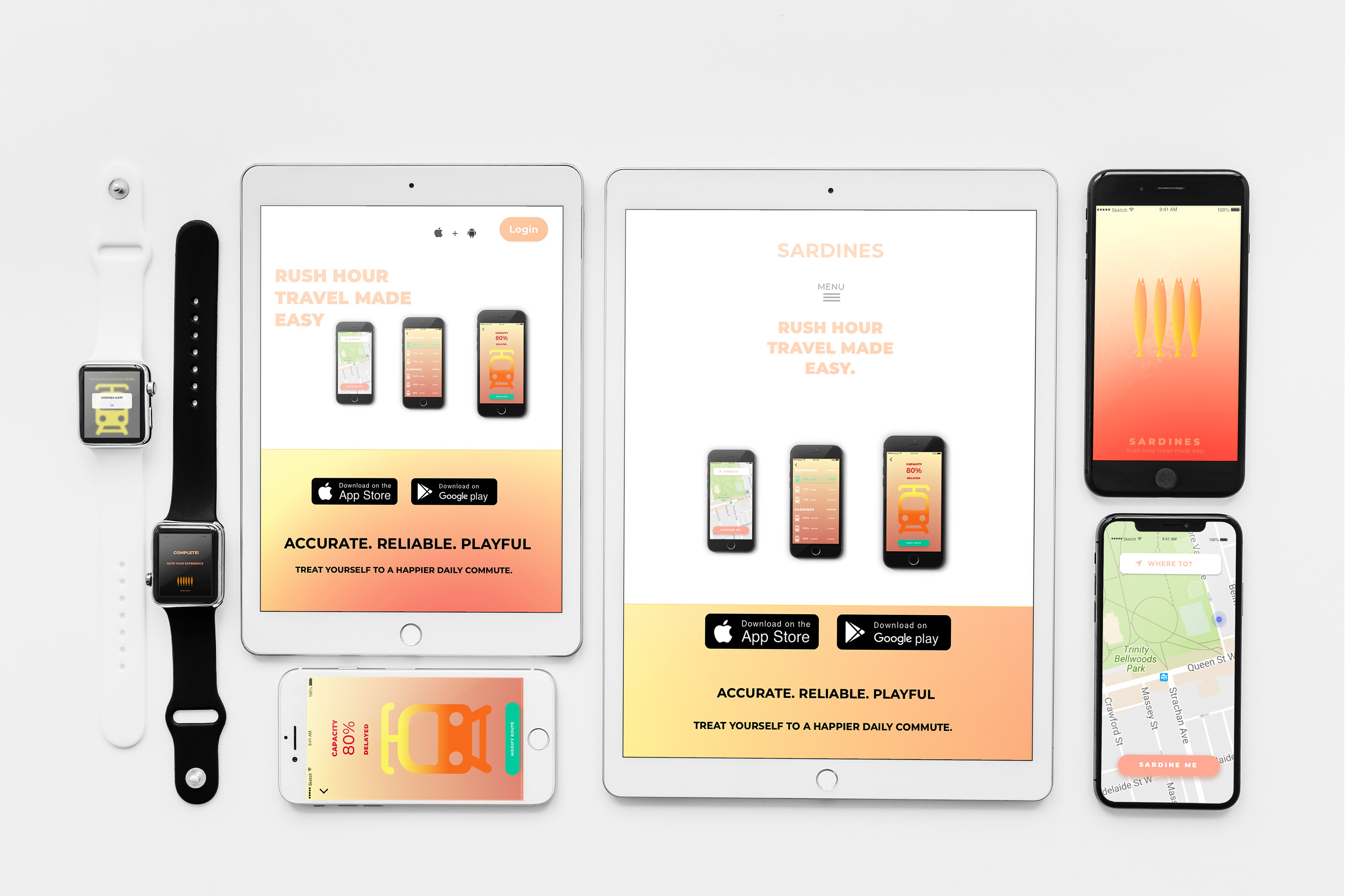
Design Decisions
The app communicates with the user in a playful and colourful manner, using hierarchy to indicate the most important feature in the app - capacity. The design consists of one typeface (Montserrat) in different weights to ensure clarity and consistency. The design elements make up of rounded corners and a colour gradient creating a friendly and calming appearance. Yellow is to represent happiness and orange is to represent sardines (crowds).
How It Would Work
Sensors will detect capacity in each streetcar. Once the user has chosen their preferred route, the following screen displays a real-time percentage of capacity, in addition to an approximate time of arrival at the destination. Push notifications will ensure the user is aware of any changes to capacity or approximate arrival time, even if the app is closed. The user can then modify the route as desired.
Being crowded into a streetcar like a tin of sardines is part of every day life for certain passengers. Taking from my competitive analysis, I discovered there is no other app that simply informs the user of capacity and overcrowding. SARDINES the app, creates a way for the TTC to better communicate with their customers.